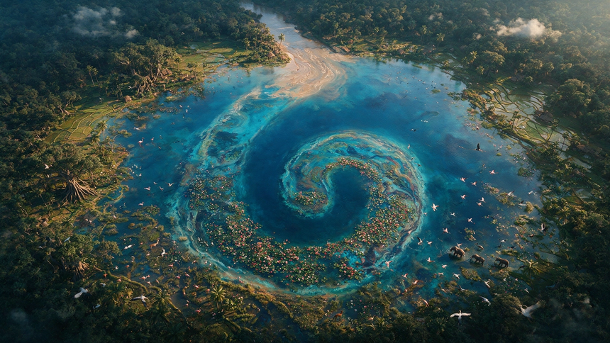
The logo was really just the beginning. I wanted GuruJal to have a visual system that could step into any space and completely own it, whether that is on a social media feed, an outdoor billboard, or a high profile fundraiser. The goal was to make the brand instantly recognizable so people from all walks of life could connect with the vital issue of water security in India. We brought this to life with a fresh color palette inspired by different depths of water, ranging from bright surface blues to deep, calm navy tones. We paired this with open source, highly readable fonts like Fira Sans to keep everything feeling premium yet accessible.
Water security is a national conversation, so the brand could not speak only English. I adapted the wordmark into every major Indian script — Devanagari, Bengali, Gujarati, Kannada, Tamil and Telugu among them — holding the droplet mark constant while each script keeps its own natural letterforms. It means GuruJal reads as itself in whichever state it works in, instead of looking like a translation bolted onto an English brand.